Snack It
A project that was given to us by Google for their certificate programme from Coursera.
Project Overview
The Product
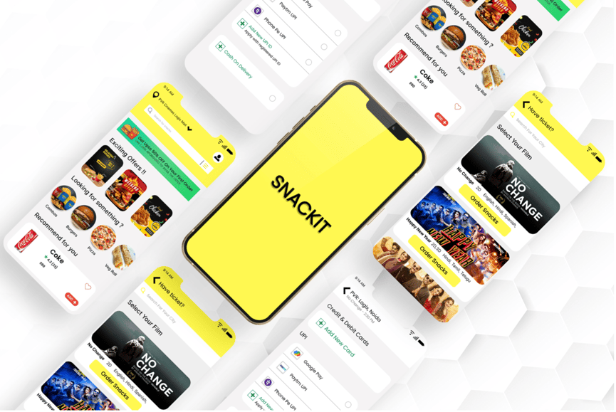
Snackit is a snack ordering app for a movie theater which strives to deliver the favourite snacks of a movie enthusiast allowing them to explore multiple options from the comfort of their seats.
Duration
Overall: 4 months, Discovery & Research: 2 months,
Design & testing: 2 months
Goal
Design a snack ordering app to deliver healthy and tasty snacks on seats to avoid the discomfort and improve the movie experience.
Problem
Discomfort to go and order food during a movie session
Tools
1 UX designer
6 developers
1 project manager
Figma
Miro
Photoshop
Team
My Role
Responsibilities
UX designer designing a snack ordering app for a movie theater.
Conducting interviews, digital wireframes, making low and high fidelity prototypes, conducting usability studies, accounting for accessibility, and iterating on designs.
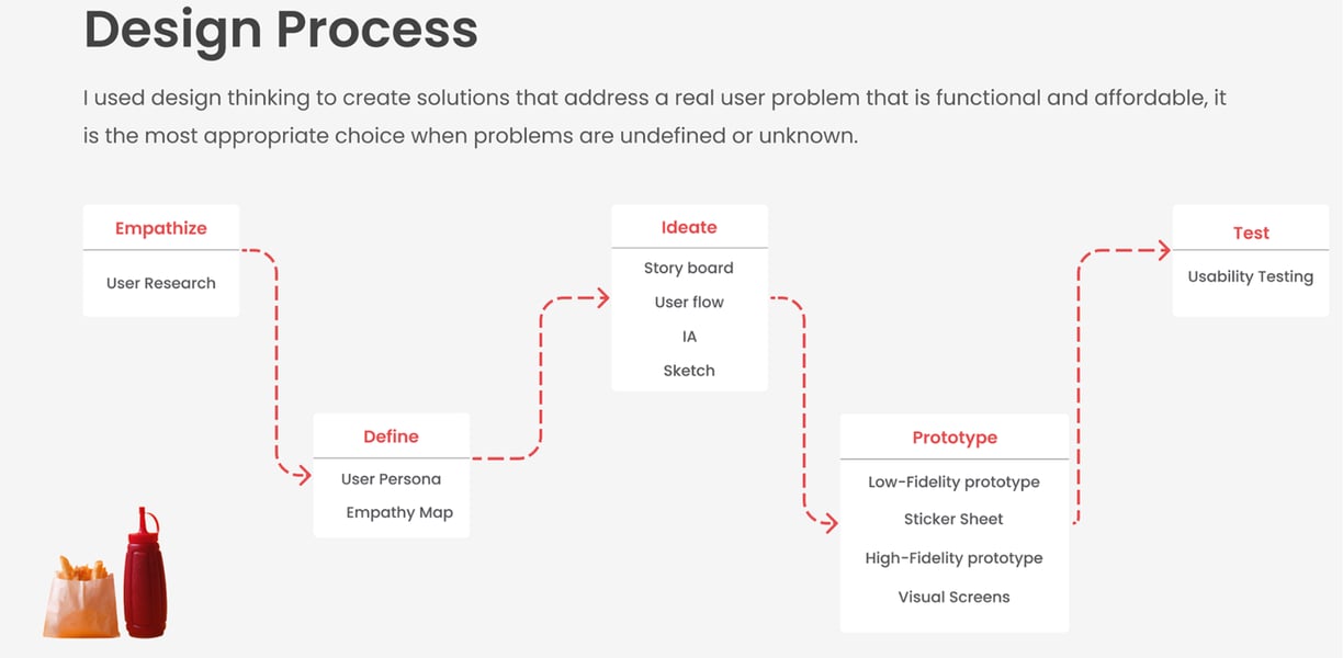
My Design Process
EMPATHISE
User Research
I have interviewed 6 people who go to the cinemas nearly twice a month, to understand the difficulty they faced while ordering food at the cinemas.
Qualitative Research
To focus on understanding user behaviours, needs, knowing them through observations and collecting feedback
User Interview
User Interview
How often do you watch movies at the theatre?
When you're with a group, do you order together or separately?
What would you choose between, online food ordering and offline purchase?
Have you ordered snacks at the cinema through an app?
Are there any specific features you would like to
have in online food ordering at the cinema app?
Did you face any difficulties while ordering food
in the cafeteria at cinemas?
Key Insights derived from the Quantitative Research:
Key Insights derived from the Qualitative Research:
• People are missing some parts of the movie while standing in line at the cafeteria.
• People are unable to choose a variety of food due to time constraints.
• Due to closed areas, people are facing internet issues while doing online payment
To get larger data set for various users segment, I used quantitative research. In the quantitative research, I created an online survey using google forms to observe any pattern and similarity in what potential users may want in the app. A total of 50 people responded which assisted me in the frame of the problem correctly.


DEFINE
Personas
We wanted to form a deeper understanding of our users' goals, needs, experiences, and behaviors. So, we created 2 persona for each of our user segments. They were based on user interviews and surveys, and we kept updating them throughout the project as we gathered more data. We used these personas whenever we wanted to step out of ourselves and reconsider our initial ideas.


User Journey Map
Mapping user's journey revealed how helpful it would be for users to have access to a dedicated Snackit app

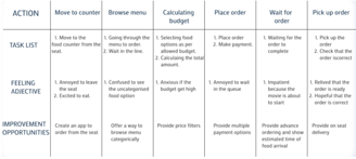
Vaani's User Journey
Vaani's journey starts with ordering popcorn in person. While it goes smoothly, she becomes thirsty after sitting down, and wishes she had remembered to order drinks as well. This time, she remembers to use the app, but picks up the drinks in person. She can't help but notice that when ordering through the app, there is no way for her to apply rewards points like she could while she was at the counter. While happy she doesn't have to wait in line again, she is worried that their seats will be taken while she gets up to get the drinks, and is thankful to find them still there upon her return. For this user journey, the following improvement opportunities were identified:
Signage should be placed around theater to promote the app, or cashier should mention it to customers
Doors should be push-to-open to accommodate people carrying snacks
Cashier should confirm if customer wants drinks or other snacks before ringing up next customer
The app should offer ways to connect rewards card with purchase
Seating should be assigned to limit issues if exiting mid-movie
A delivery service should be created to bring orders directly to seats
Usha's User Journey
Usha's journey starts with downloading the app in the hopes it will improve her movie theater experience. She is able to add his selection to the cart, but still has to contact her friends and ask them all if they want anything. She is able to place his order for pick-up with an option to pay at the counter, which she is pleased about, but finds customer service lacking once she gets there. She has to wait at the counter just as long as she would have to in line because the theater is understaffed, and while she does finally get her order, she wonders if she should have just waited in line after all.
For this user journey, the following improvement opportunities were identified:
Offer a bonus or discount for first-time users
Add a way to invite people to group orders
As part of group ordering, separate out items into groups for distribution and preview in-app
Allow selection for pick-up time in advance of final order confirmation
Have dedicated staff at pick-up area to handle in-person payments
While many of the opportunities identified in both situations had more to do with the theater, rather than the app, I still feel like it is the designer's job to make the process as smooth and pain-free as possible. An easy ordering process, and clear communication within the app, makes it easier to for people to decide to trust a delivery service or forgive a busy night behind the counter. I would like to state though, that in a real-world situation opportunities such as increased signage or staffing concerns would be brought to the appropriate team to rectify in conjunction with the launch of an app.
Solution
After going through my research, Empathizing with the users and observing pain points, finally came up with a idea.Creating a web-based application allowing users to order online, inturn saving time & effort to buy snacks at the movies
Competitive Audit
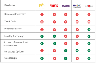
Researched and analyzed various features, functions and flow that were present in competitor's products, By identifying key aspects of those competitors, I found that none of competitors offered snack customization and order tracking.
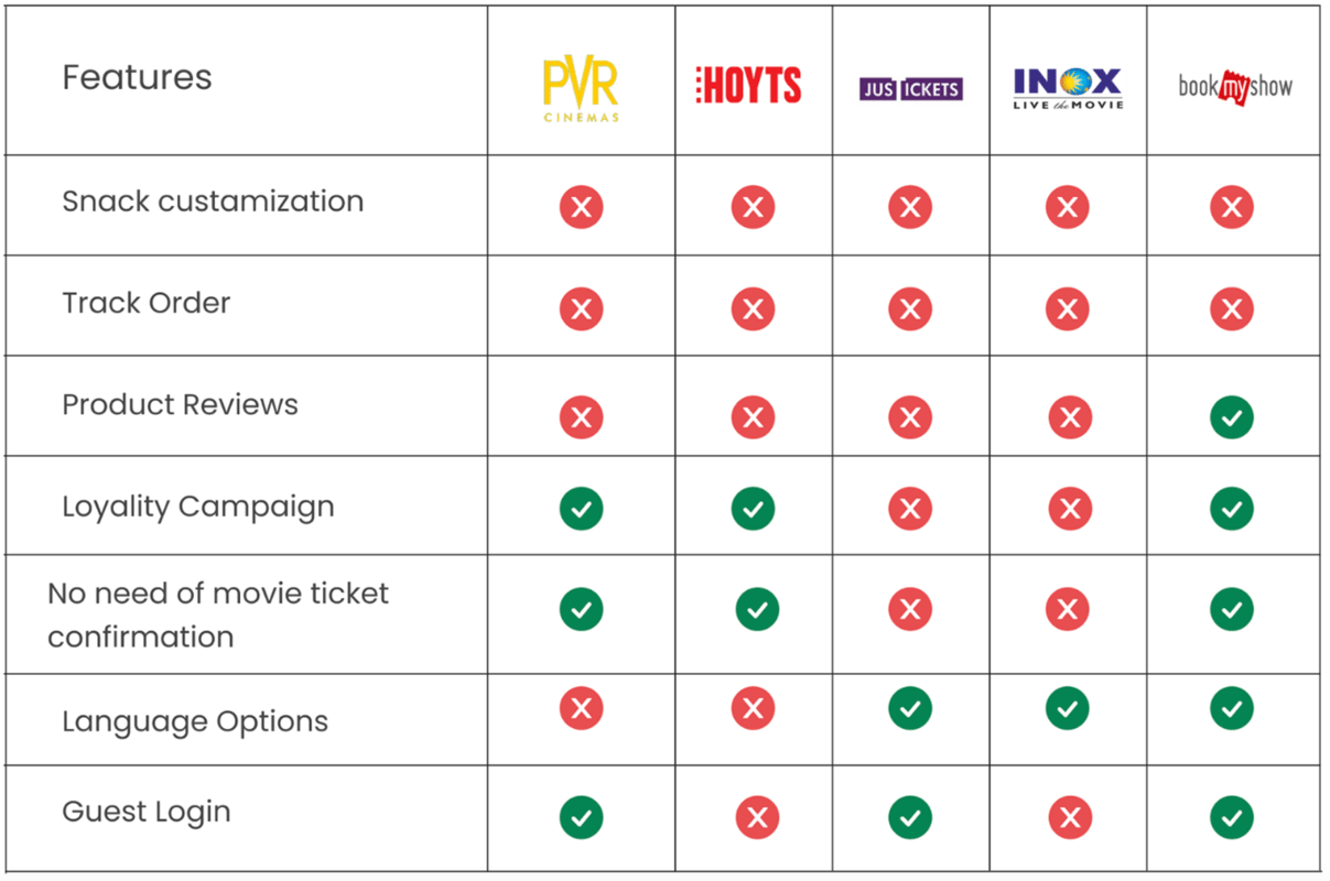
Competitive Audit
Storyboard
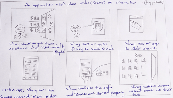
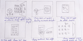
I have created storyboard to create a visual connection between the user insights that I have covered during research and the flow of experience.


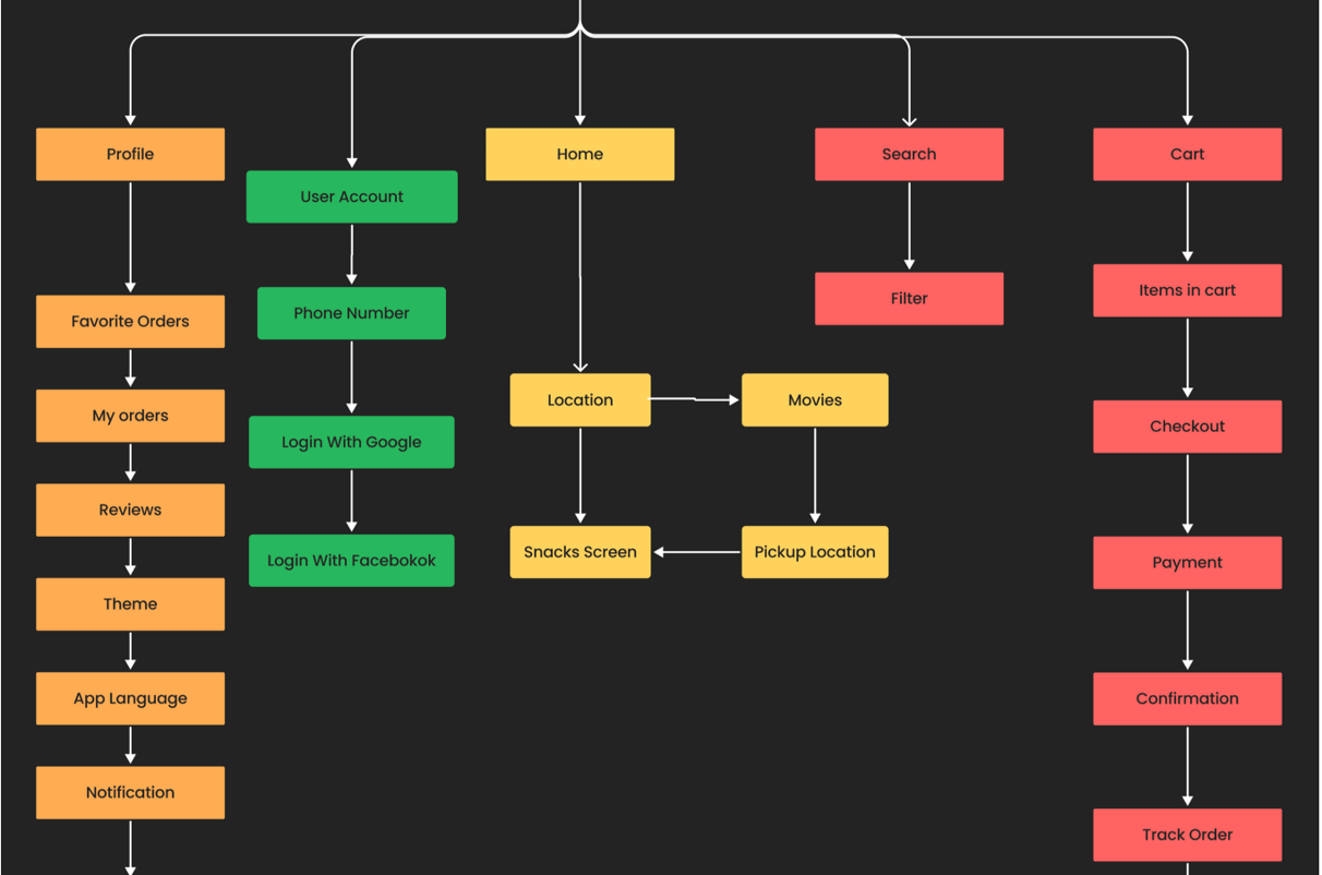
User flow
To map how user's achieve a specific goal as they move through snacit functionality.
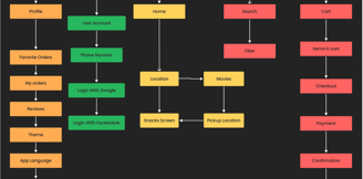
Information Architecture
I have created I.A to organise content to help users understand where they are in snacky and what information they want.
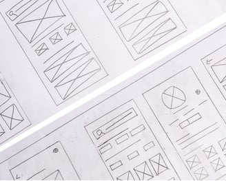
Sketch
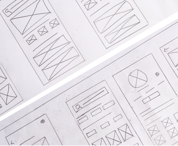
I began the design process with low-fidelity sketches and wireframes to accelerate decision-making through visualization without losing time. My sketches were based on the initial user interviews, the business goal, and the heuristic evaluation. They each pointed to the fact that there were too many distractions in the flow. We came back to the sketches throughout the entire design process to make sure that we don’t lose sight of our primary goals and ideas.
Information Architecture
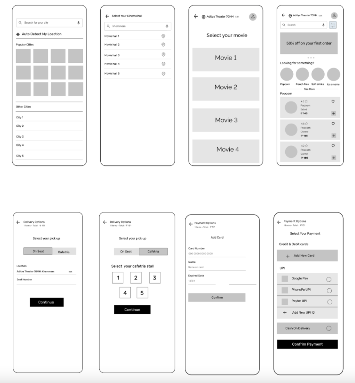
I have created wireframes to understand the basic structure of snacky to present the content, information and basic layout before Ul design.
Prototype Phase
Low Fidelity Wireframes
I took the time to draft iterations of each screen of the app on paper to ensure that the elements that made it to digital wireframes would address user pain points. Easy navigation was a key user need to address in the designs in addition to equip the app to work with assistive technologies. I created both Low Fidelity and High Fidelity wireframes
Test Phase
From UX research study, Conducted two rounds of moderated usability study with Target audience to understand & iterate on how usable is the product is.
Round 1
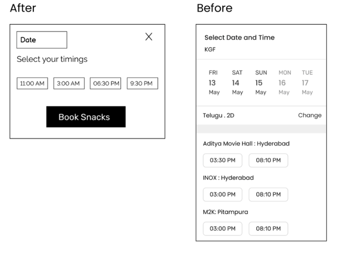
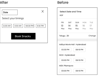
• It was observed that 80% participants can't able to schedule their movie.
• It was observed that 60% participants don't know where they can collect snacks.
• It was observed that 80% participants wanted to see what they get in combo.
Iterate On Design
• It was observed that 80% participants can't able to schedule their movie.
• It was observed that 60% participants don't know where they can collect snacks
• It was observed that 80% wanted to see what they get in combo


UI Design
Once the usability issues were resolved, I moved on to design the final screens in Figma. My goal was to create a visual identity that’s aligned with the brand’s values and message, which is: “brand motto”. Also, I’ve checked the competition and took a deep dive into my catalog of references for inspiration.

Accessibility Considerations
1. Dark mode and WCAG compliant colors for better contrast and to accommodate for those with visual impairments.
2. PayTm, Google Pay, and option to use a saved payment method so users with visual impairment(s) do not have to try to read/type their credit card number in low light settings.
3. Alt text on images for users who are visually impaired.
Takeaways
Impact:
This app made users feel better and more likely to order snacks at the movies. One quote from usability testing was: “This app is very intuitive and easy to use. I would definitely see myself using this to order snacks at the movies rather than [ordering] at the counter.”
What I learned:
While creating this app feature, I learned that usability studies really help shape the final outcome of the app’s design and functionality.
Next Steps
1. I would like to add a calorie counter to help those who are conscious about what they are eating.
2. Add a interactive seat map so users can select their seat, or type in the seat number.
3. Get real world data and feedback on how the features are accepted by users and if there are any issues to address that would not appear in a controlled environment.
Let's Get In Touch
Got a partnership idea, or a project you need help with? Shoot me a line and let's talk.
